
Cohesive Home Design for Less
Start with a Cohesive Vision
Map the Flow and Functions
Sketch the daily journey from door to desk to dining, noting bottlenecks, noise, and light. Assign each zone a job and an adjacent support surface. This honest map reveals where integration matters most, guiding focused upgrades instead of scattered décor that never quite works.
Create a Palette that Works Everywhere
Limit base colors to two neutrals and one accent family, then vary saturation and texture by room. When flooring tones connect, trim color repeats, and metals remain consistent, affordable pieces feel intentional. A restrained palette reduces costly repainting and simplifies future purchases across seasons.
Unify with Repetition and Rhythm
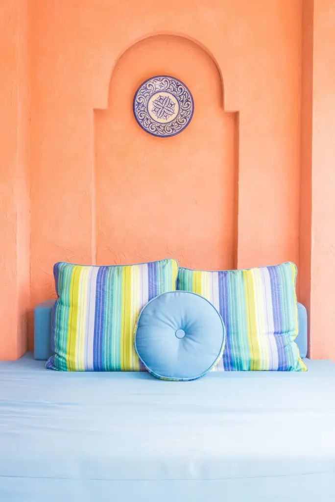
Repeat handles, wood tones, curtain styles, and rug proportions to create rhythm a visitor senses immediately. Even thrifted finds feel connected when profiles echo. Choose one visual motif—arches, slats, or grids—and let it reappear subtly, steering decisions and shrinking options so prices, and doubts, stay low.
Smart High–Low Combinations
Alternative Surfaces with Presence
Upcycling with Discipline
Materials that Stretch Every Dollar

Create an Ambient Spine
Run a consistent ambient strategy through connected spaces: ceiling washes, low-glare fixtures, or tall lamps that bounce light. Keep color temperatures within a narrow range, so rooms read as a family. A gentle spine calms the home and frames moments where accents can sing.
Tell Stories with Accent Light
Direct small, focused beams onto artwork, plants, shelves, or textured walls to create continuity points. Repeat a signature glow, like warm halos behind headboards or cabinets. These cues guide attention between zones, adding perceived richness without expensive furniture or complicated construction, especially in compact apartments.
Simple Controls, Big Impact
Group fixtures by activity and install dimmers or smart bulbs where rewiring is impractical. Scenes for cooking, reading, and winding down create repeatable comfort. Coordinated controls reduce visual clutter from switches, support energy savings, and make integrations feel intentional rather than patched together late.
Furniture That Bridges Spaces


Neutrals as a Harmonizing Base

Textiles that Echo, Not Match
Phasing, Budgeting, and Community Support

All Rights Reserved.